
You can edit an existing Dashboard to change its layout, add or remove Visualisations, or adjust what information each Visualisation displays.
This allows your Dashboards to evolve as your team's production monitoring and analysis needs change.
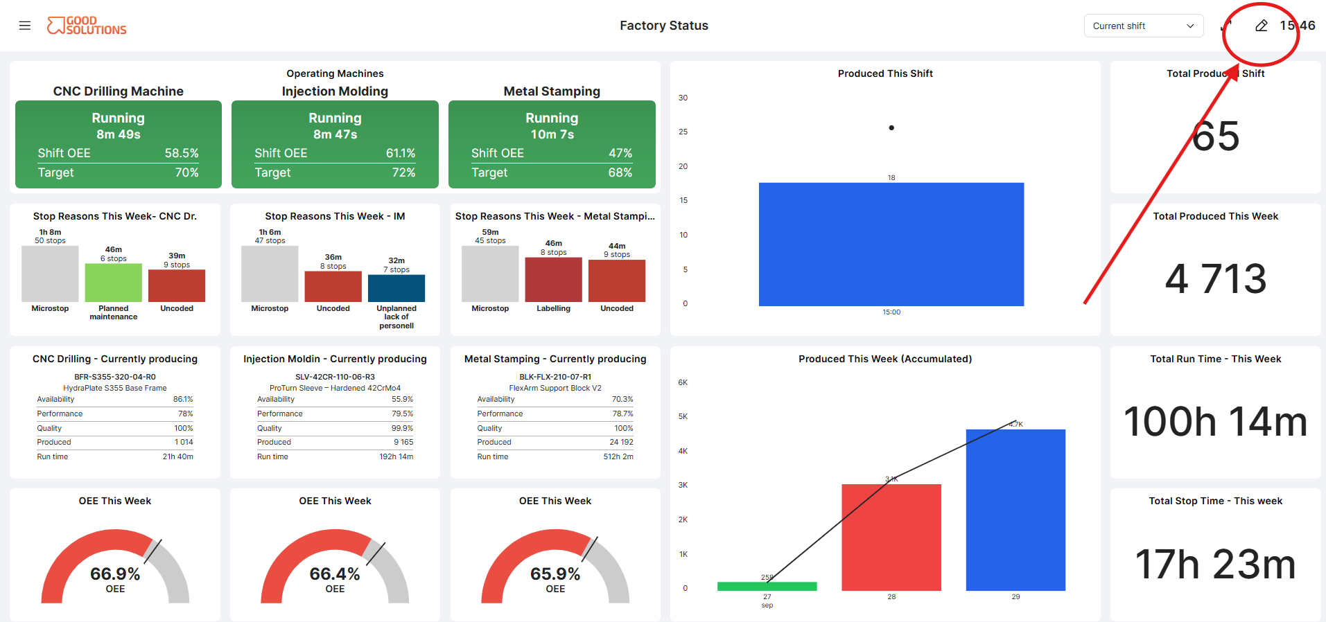
Open a Dashboard for editing
To edit a Dashboard:
- Open Dashboards in the Good Solutions web product.
- Find and open the Dashboard you want to change.
- Select Edit to enter Edit mode.
In Edit mode, you can change the content and layout of the Dashboard.
Add a Visualisation
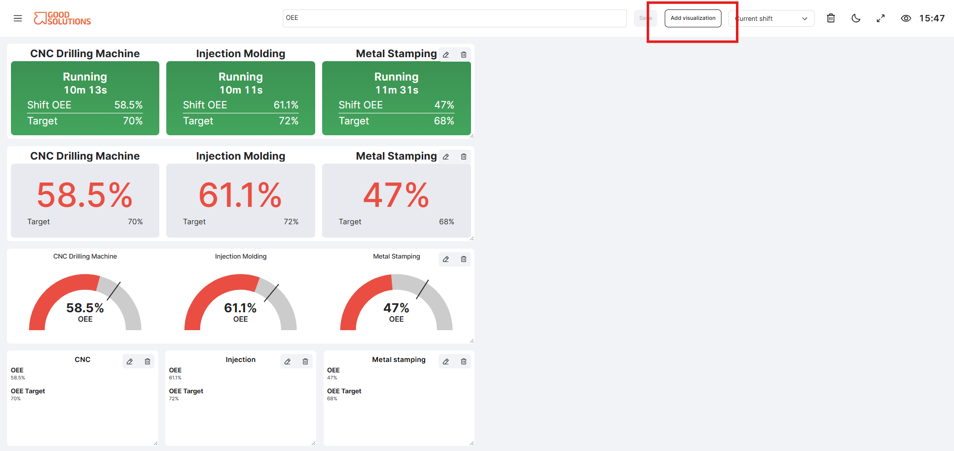
To add more information to your Dashboard:
- Select Add Visualisation.
- Choose the type of Visualisation you want to add.
- Configure what the Visualisation should display.
- Confirm your selection.
The new Visualisation is added to the Dashboard.
NOTE! If the Add visualisation button is grey and you are unable to click it, it means that there is no more room on the dashboard and you have to remove a visualisation before adding new ones.
Edit a Visualisation
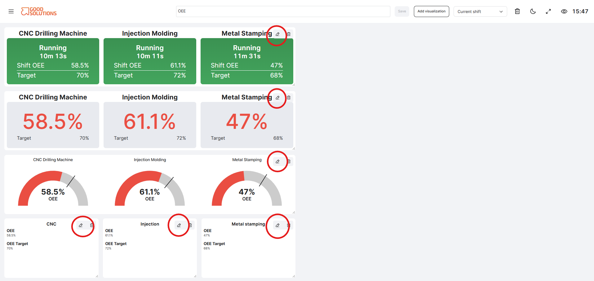
Existing Visualisations can be configured individually.
- Find the Visualisation you want to change.
- Open its settings.
- Change the available configuration options.
- Save your changes.
The available settings depend on the type of Visualisation. For example, you may be able to change the Measure Points, metrics, targets, grouping, or other information displayed.
Move and resize Visualisations
You can arrange Visualisations to determine how information is presented on the Dashboard.
In Edit mode:
- Move a Visualisation to change its position.
- Resize a Visualisation to control how much space it uses. Grab the bottom right corner of a visualisation with your cursor and expand/contract it.
- Arrange related Visualisations together to make the Dashboard easier to understand.
Consider placing the most important information where users can see it immediately.
Remove a Visualisation
If a Visualisation is no longer needed:
- Click the thrash bin icon on the top right of a visualisation. This only works if the Dashboard is in edit mode.
- Confirm the action.
Removing a Visualisation from a Dashboard does not remove the underlying production data.
Review your changes
When you have finished editing, return to View mode and review the Dashboard.
Check that:
- The most important information is easy to find.
- Visualisations are arranged logically.
- Each Visualisation displays the intended production data.
- The Dashboard works well at the screen size where it will normally be used.
For Dashboards displayed continuously on production-floor screens, it is especially useful to check that important information can be understood quickly without user interaction.
Keep your Dashboard focused
More information does not always make a better Dashboard. Consider the purpose of the Dashboard when deciding what to include.
For example, a production-floor Dashboard may focus on current status, production, OEE and major losses, while a Dashboard used for production meetings may include more detailed Visualisations for analysing stops, quality and trends.